HBF Mobile App & Member Self-Service Portal
UX Design
At HBF I worked across both the Mobile App and Member Self-Service teams, embedded in both at the same time. When I started, the design team was just myself and my senior designer. Between us, we were responsible for two pretty big pieces of work:
-
Growing and improving the HBF mobile app
-
Helping design a brand new self-service portal as part of HBF’s wider transformation program
As the work grew, so did the team. By the end there were four of us, but in those early days we wore a lot of hats and had the chance to shape not just the products, but how the team worked.
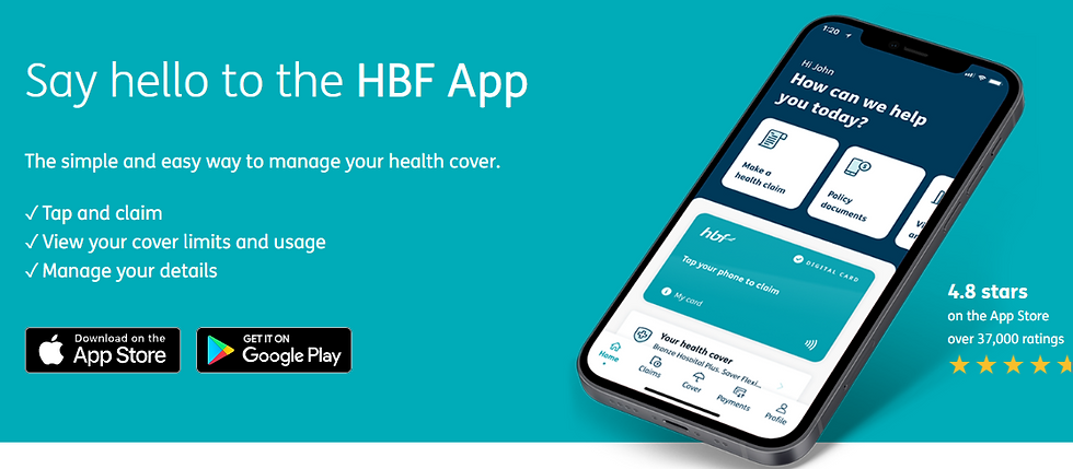
The HBF app is used by more than 1.2 million members, so every change had to be considered carefully. We needed to improve and modernise the experience without disrupting something people already relied on. Keeping the app sitting above 4 stars in the app stores was always important to us, so there was a real focus on making sure new ideas genuinely made life easier for our users.
As I am limited in what I can show publically of this work. Please contact me to learn more about it in person.

What I worked on
I worked right across the process, from early research through to final implementation.
That included:
-
Running workshops with stakeholders and subject matter experts
-
Conducting user interviews and exploratory research
-
Creating wireframes, flows and interactive Figma prototypes
-
Working on the design system across both products
-
Collaborating closely with developers during handover and implementation
-
Reviewing builds and conducting UX/UAT testing
-
Facilitating workshops around accessibility, design quality and best practice
I spent a lot of time working closely with researchers, developers, product managers and compliance teams. The best solutions nearly always came from strong collaboration and a shared understanding of what members actually needed.
Designing for Health Insurance
One of the more interesting challenges of the role was designing in a heavily regulated industry.
Health insurance comes with a lot of legal language, policy details and mandatory information. Often our job was to take something complicated, intimidating or full of jargon and turn it into something that felt clear, human and easy to understand.
A big part of the role was finding the sweet spot between:
-
Meeting regulatory and legal requirements
-
Keeping things simple and user-friendly
-
Staying true to HBF’s warm, supportive tone
There was often a bit of a balancing act involved. Sometimes a screen needed to communicate a lot of information, but still feel approachable rather than overwhelming. It was one of those puzzles I genuinely enjoyed solving.

Growing the Design System
When I joined, HBF already had a design system, but it was mostly a static reference inherited from an external consultancy. It was useful as a starting point, but it wasn’t something the team really lived and breathed day-to-day.
I championed the progession of the design system into an active and practical system used across both the app and self-service portal. Transforming it into a living part of the way we worked.
That included:
-
Expanding and refining the component library
-
Creating reusable patterns and interaction guidelines
-
Improving consistency between the two products
-
Pushing accessibility standards further
-
Helping designers and developers work from the same source of truth
-
Running workshops on how to set up components and prototypes


How We Worked
As the app was already live and widely used, we couldn’t just make changes based on instinct alone. We needed to understand what members wanted, test our ideas properly and make sure we were solving the right problems.
For most projects, the process looked something like this:
-
Discovery
-
Work with our researcher to interview members and understand what they actually needed
-
Look at analytics, support pain points and business goals
-
-
Design
-
Turn those insights into concepts, flows and interactive Figma prototypes
-
Explore different approaches and collaborate with the team along the way
-
-
Testing
-
Run user testing and A/B testing to see what was working and where people got stuck
-
Refine and iterate based on what we learned
-
-
Delivery
-
Hand designs over to developers and walk through the intended experience
-
Review builds and complete UX/UAT testing to catch issues before release
-
A lot of the success of the team came down to good communication. Designers, researchers, developers and product managers all worked very closely together, and that collaboration made a huge difference.


Outcome
Over my time at HBF, I helped gradually modernise both the app and the self-service experience while supporting a product already used by more than a million people.
Some of the things I’m most proud of are:
-
Helping maintain a 4+ star app rating while delivering significant changes
-
Growing a static design system into something genuinely useful and widely adopted
-
Improving accessibility and design standards across the team
-
Helping grow the design practice from a team of two to a team of four
-
Contributing to products that made complicated health insurance tasks feel a little simpler and more human
By the end of my time at HBF, the design system was being used across both the mobile app and self-service portal by designers and developers, helping speed up delivery and create a more consistent experience. I love the challenge of taking something dense, technical or a little intimidating and turning it into something that feels simple, calm and genuinely helpful.
Working at HBF taught me a lot about designing within complexity: balancing user needs, business goals, regulation and technical constraints, all while working with a great team to create something people genuinely rely on every day.
Want to know more?
Learn more at HBF.com

Snow presents an introduction to Atomic Design for HBF chapter

Research done on photosensitive epilepsy and animation speeds